
Because I enjoyed creating my rebus poster so much, I thought about what other words relating to design I could try and interpret.
So I came up with this bright idea! 😉
Below are two more ideas I developed


Because I enjoyed creating my rebus poster so much, I thought about what other words relating to design I could try and interpret.
So I came up with this bright idea! 😉
Below are two more ideas I developed
To create my information guide I used a technique that I learnt from my animation complementary study, which was stop motion, and how to make a ball bounce . Instead of drawing the frames by hand I drew each frame digitally using a combination of Illustrator and Photoshop. As learning primary colours and colour mixing is a simple process I wanted to reflect that within my moving image so I used a chalk board to give it an educational aesthetic and the different coloured balls bouncing into the paint pots help make it more fun and engaging.
I choose colour as my topic because I think that it is very important for every graphic designer or creative person to know the basics of mixing colour because it is the basis for understanding how to play with the ‘rules’ and know what works well together. I find colour theory very interesting.
For me as an information guide I wanted it to be as simple and clear as possible so it was easy to understand. My aim is to explain things how I would like them to be explained to me. I had a few trials with the timing of the text, making sure the audience would have long enough to read the written information.


One of the main things I learnt this year was semiotics, so I wanted to use that as the basis for my poster. Initially I was going to do my own version of ‘Ceci n’est pas une pipe’, instead doing ‘This is not a pencil’ written in pencil and photographed with a pencil. But I decided that the type wouldn’t be very strong for a poster. So still wanting to incorporate semiotics, I thought about rebus; where I had the idea of showing rebus using rebus! Rebus is a communication method that has been used as far back as the middle ages.
Definition – A rebus ( \ˈrē-bəs\ ) is an allusional device that uses pictures to represent words or parts of words.
So I drew a pictogram of a simple bus using illustrator and incorporated it with the type ‘RE’. Choosing black and white with the red for the bus and type. I tested out two different versions one just on its own and another with the definition of rebus underneath. I think the one on its own is stronger and although certain people might not understand it to begin with, it creates intrigue and I like how it has a sense of irony.

I was already aware of Paul Rand’s IBM logo, which cleverly employed rebus. But researching a little deeper I found out that in 1985 IKEA used rebus in an advertising campaign in order to assist Americans with the correct pronunciation of the Swedish company.


Hornall Anderson’s 2001 “Soak it Up” logo for Seattle was another rebus logo beginning with a pictogram eye. In this case, however, the eye is a sideview and we’re meant to interpret the symbol as “see.” (10 Rebus Logos, 2015)

Above is my final animation. Below is an alternative that I did as a test to see if colour worked, in the end I decided to stick to black and white as it fits the shadow theme better.
In conclusion of my final animation creation process I am very pleased with the overall outcome, largely sticking to my original plan and rough storyboard, I didn’t really face any difficulties. I was able to compartmentalise the poem and tackle each line at a time. It was important to me that the main protagonist, the shadow had a little bit of character that the audience would be able to invest in, so by adding subtle details of clothes and a little bit of hair it made the shadow more appealing and realistic whilst still remaining simplistic.
Simplicity was key; as this is the first time I have ever done this kind of traditional animation I didn’t want to add unnecessary details, instead the main focus of telling the narrative of the poem. Also the traditional methods used to create the animation reflected the ‘classic’ poem. I feel it was the best animation technique to employ. As I had previously learnt during the second week of complementary studies I discovered from my bouncing ball animation that it was best to use a pen to go back and outline the images so that they would stand out and be more clear once scanned, therefore I made the decision to illustrate my drawings using a black sharpie marker. As my animation included text I had to do a few tests adjusting the speed enabling it to be more readable. I made the decision to add some instrumental music making it more lively and exciting as a piece to watch.
To reaffirm, I think that my animation was created to the best of my ability and successfully tells the poems story to the audience.
I was particularly inspired by the ball bouncing animation I had created during the second week. There is a line in the ‘My Shadow’ poem which goes: ‘For he sometimes shoots up taller like an india-rubber ball’ I planned to show the shadow morphing into a ball which bounced up and down.

This was my first attempt, using pencils to get the rhythm right and planning what shapes and position the ball would be on the page. Once I was happy with the way it looked after scanning it onto the computer, I did a more solid and shadow like version using a black sharpie marker.
I had originally planned to do my whole animation monotone. However I thought it would be a good idea to test what it would look like if I added some colour. Below are the test versions I did to see how the colour compared.


Below are a few examples of the still frames from my animation:


For my final animation, I want to animate one of my favourite childhood poems by Robert Louis Stevenson, which is called ‘My Shadow’. This would be created using a traditional hand drawn method, with a light box and paper. The animation itself will be black and white and have a simplistic drawn style; following the narrative of the shadow. Although it is a fairly short poem, not all of the verses will translate into an animation therefore it might potentially feature words. However, the main focus being the shadows journey.

By using traditional methods, the main difficulties will be producing an animation of sufficient length. So the main aim is to make sure each second is of high quality and will run smoothly – successfully telling the poems story that will ultimately connect to the audience.
Initial storyboard ideas:


During the trip to London, I visited the Big Bang Data exhibition at Somerset House. This exhibition was all about different ways of displaying data and how its evolving within our society, for example social media; there was one exhibit that had the software to recognise all of the cats that have ever been posted onto the social media photo sharing network Instagram.
Another, which I took photos of was lots of globes that were lit up and each one was showing a different piece of information about the earth. The whole exhibition tying in with semiotics, improving my knowledge of how it can be incorporated into design.


Below are some more of my photos:

St Paul’s Catherderal, which was right by where we were staying in a Youth Hostel. It struck every half an hour!

The London Eye.

The grand front of Somerset House where the Big Bang Data exhibition was held.

A typical London scene; red bus, red telephone box and traditional architecture.

Busy streets.

Design Influence in the 1950’s was the decade our group was given. We divided the key topics between us. I covered advertising and branding which had a huge impact on design, as it was just emerging in the 50’s. I also covered social and cultural trends and film. As a whole our group determined the main design style of that time was ‘Pop art’, so I took on the role within our group designing our presentation slides. I wanted them to reflect the pop art style so included speech bubbles for each heading and a typical dotted background, the others liked this style and added their own words and pictures. By having a good template for the presentation it helped give it continuity and represent us more as a team.
Below is my research and notes for the presentation:
Advertising and Branding – With colour printing and colour TV and a new innovation in product design, advertising had more importance. In their quest to encourage consumers to buy and replenish products that weren’t necessities, advertisers and agencies in the late 1950s began to rely on techniques such as motivational research and demographic targeting.
Baby Boom – In the 1950’s birth-rates increased dramatically. With the soldiers finally coming home from the War, couples were keen to start families. At the beginning of the 50’s a record 3.8 million babies were born, that is the equivalent of a baby being born every 7 seconds.
Teenagers – The word ‘Teenager’ was in fact created in the 1950’s due to the vast population of those in this age group as a result of the baby boom. Teenagers were becoming more independent, setting trends with music, clothing and hairstyles. Youngsters were no longer “little adults” instead they had their own identity; as a result of this design had a new target audience demographic, so things were being designed specifically for that group.
Rock ‘n’ Roll – Rock and roll was primarily a label used to classify the new music of the era. It influenced everything from lifestyles, dance, fashion and attitudes. Pioneers of this genre were musicians like Elvis Presley, Bill Haley & His Comets, Johnny Cash and Buddy Holly. “Rock and roll was one of the first music genres to define an age group…It gave teenagers a sense of belonging.” (Padel, Ruth (2000). I’m a Man: Sex, Gods, and Rock ‘n’ Roll. Faber and Faber. pp. 46–48.) Instead of teenagers following the traditional trends, it was seen as a rebellious phase. Where they were making their own decisions and wanting to be separate from their parents.
Films – One of the things I noticed when researching films of the 50’s was the amount of science fiction films were released throughout the decade.
This period is sometimes described as the ‘classic’ era of science fiction theatre. The production of the films was low-budget, targeted specifically at a teenage audience. Many were gimmicky and had a comic-book style this was a reflection of the pop art culture.
Hollywood stars
James Dean was the epitome of and anguished teenager and Marlon Brando in On the Waterfront (1954) was an icon of the time, this new generation of method actors helped influence the next generation.
Marilyn Monroe was a big film star, being one of the first actresses to be used as an ambassador for advertising campaigns.

Where better to start my research for animation than Walt Disney. I came across a very interesting and informative article about the history of Mickey Mouse. Reading this article proved to me the impact animation can have worldwide, Mickey Mouse’s ears are one of the most iconic images of the 20th and 21st centuries. He has posed for photographs with every U.S. President since Harry Truman, save one (Lyndon Johnson never visited a Disney theme park). Mickey Mouse is a character that is completely synonymous with Disney and it all started with the success of Steamboat Willie in 1928.
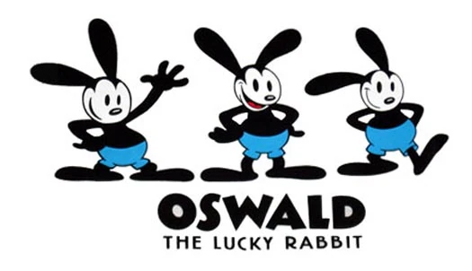
Mickey’s story, starts with a rabbit. Disney Brothers Studio was a subsidiary of the Universal Pictures’ animation machine when, in 1927, Walt Disney created a character called Oswald the Lucky Rabbit. Oswald was an instant hit and Universal ordered a series of shorts. When Disney met with executives to negotiate another contract in 1928, He discovered that Universal had hired Disney’s animating team and retained the rights to Oswald. Universal offered to keep Disney if he took a lower salary, but he refused. He and Ub Iwerks (the one loyal animator who stayed with Disney Bros.) returned to work and set to work designing an Oswald replacement. They shortened the ears, added some extra padding around the middle, and turned the rabbit into a mouse. Originally named Mortimer but for unknown reasons he made his debut as Mickey.

The first two Mickey shorts drew no attention, but then came Steamboat Willie, the first animation to feature synchronized music and sound effects, hit the screen. The film premiered in New York on Nov. 18, 1928 and was an instant hit. A series of Mickey Mouse shorts appeared within a matter of months — including Plane Crazy. The mouse was a national fad by the end of the year, and it wasn’t long before the real genius of Walt Disney kicked in: marketing. Walt quickly started up a line of Mickey merchandise, and within two years the Mickey Mouse Club, a fan club for children, was up and running.

In 1935, a young animator named Fred Moore gave Mickey his first makeover. Earlier animators had drawn the mouse as a series of circles, which limited his movement. Moore, who later animated Fantasia‘s Sorcerer’s Apprentice segment gave him a pear-shaped body, pupils, white gloves and a shortened nose, to make him cuter. Mickey also appeared in colour for the first time that year; The Band Concert’s use of Technicolor was so innovative that critics still consider it to be a masterpiece. By 1937, Disney Studios was producing about 12 Mickey shorts a year, with Disney himself providing the mouse’s high-pitched voice.

Soon Disney feature films like Bambi and Sleeping Beauty began to rake in the accolades and box office receipts as animation progressed through the decades become more intricate and advanced. (Suddath, 2008)
Bibliography
Suddath, C. (2008) A BRIEF HISTORY OF Mickey Mouse. Available at: http://content.time.com/time/arts/article/0,8599,1859935,00.html (Accessed: 16 March 2016).
The flour sack is a simple method animators have been using since 1930 to practise weight and pose with expression. It is a good place to start as a budding animator because it enables you to play with squash and stretch, shape change, and weight while still maintaining a simple character full of life.
The ties on the flour sack are there to give anthropomorphism to the simple animated shape. Their ultimate purpose for existing is to increase expression and performance of the character, without them it isn’t quite so expressive. (Riki, 2014)

Below are a variety of various expressions the flour sack can achieve.

I had a go at creating my own flour sack animation, starting with it walking showing how the weight adjusts with each movement.

Bibliography
RIKI, J.K. (2011) Animation secret: The flour sack. Available at: http://www.animatorisland.com/hello-world/ (Accessed: 9 March 2016).
RIKI, J.K. (2014) Don’t turn your animated flour sack into a roasted turkey. Available at: http://www.animatorisland.com/dont-turn-your-animated-flour-sack-into-a-roasted-turkey/ (Accessed: 9 March 2016).

