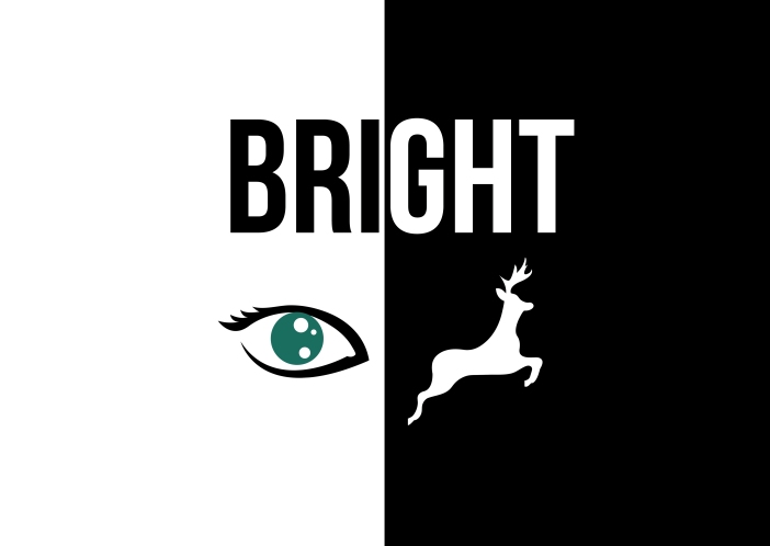
Because I enjoyed creating my rebus poster so much, I thought about what other words relating to design I could try and interpret.
So I came up with this bright idea! 😉
Below are two more ideas I developed
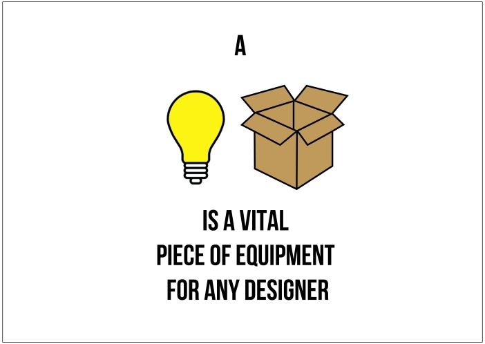
Because I enjoyed creating my rebus poster so much, I thought about what other words relating to design I could try and interpret.
So I came up with this bright idea! 😉
Below are two more ideas I developed
To create my information guide I used a technique that I learnt from my animation complementary study, which was stop motion, and how to make a ball bounce . Instead of drawing the frames by hand I drew each frame digitally using a combination of Illustrator and Photoshop. As learning primary colours and colour mixing is a simple process I wanted to reflect that within my moving image so I used a chalk board to give it an educational aesthetic and the different coloured balls bouncing into the paint pots help make it more fun and engaging.
I choose colour as my topic because I think that it is very important for every graphic designer or creative person to know the basics of mixing colour because it is the basis for understanding how to play with the ‘rules’ and know what works well together. I find colour theory very interesting.
For me as an information guide I wanted it to be as simple and clear as possible so it was easy to understand. My aim is to explain things how I would like them to be explained to me. I had a few trials with the timing of the text, making sure the audience would have long enough to read the written information.
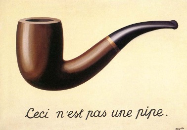
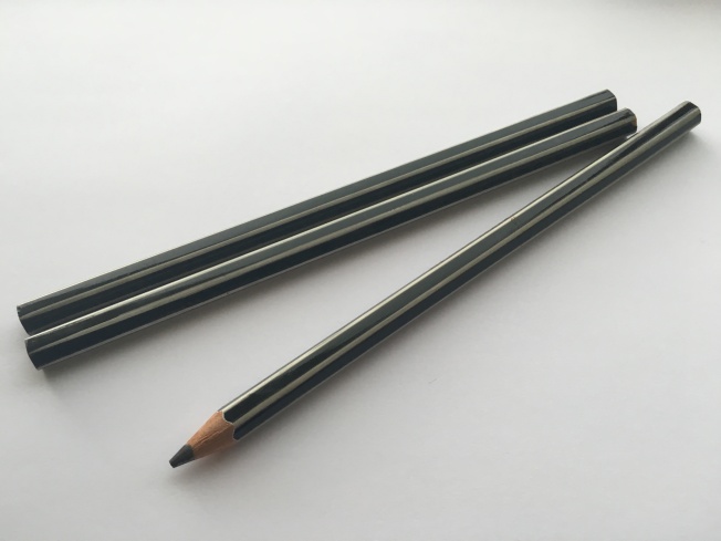
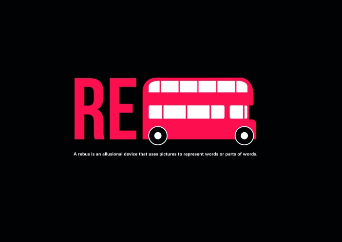
One of the main things I learnt this year was semiotics, so I wanted to use that as the basis for my poster. Initially I was going to do my own version of ‘Ceci n’est pas une pipe’, instead doing ‘This is not a pencil’ written in pencil and photographed with a pencil. But I decided that the type wouldn’t be very strong for a poster. So still wanting to incorporate semiotics, I thought about rebus; where I had the idea of showing rebus using rebus! Rebus is a communication method that has been used as far back as the middle ages.
Definition – A rebus ( \ˈrē-bəs\ ) is an allusional device that uses pictures to represent words or parts of words.
So I drew a pictogram of a simple bus using illustrator and incorporated it with the type ‘RE’. Choosing black and white with the red for the bus and type. I tested out two different versions one just on its own and another with the definition of rebus underneath. I think the one on its own is stronger and although certain people might not understand it to begin with, it creates intrigue and I like how it has a sense of irony.
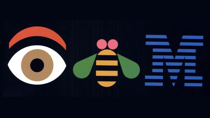
I was already aware of Paul Rand’s IBM logo, which cleverly employed rebus. But researching a little deeper I found out that in 1985 IKEA used rebus in an advertising campaign in order to assist Americans with the correct pronunciation of the Swedish company.
![]()
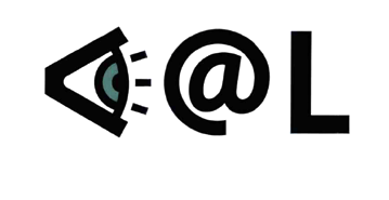
Hornall Anderson’s 2001 “Soak it Up” logo for Seattle was another rebus logo beginning with a pictogram eye. In this case, however, the eye is a sideview and we’re meant to interpret the symbol as “see.” (10 Rebus Logos, 2015)